Cue the visuals: New Yorker cartoonist and TED-Ed animator host a TED-Ed Club Workshop

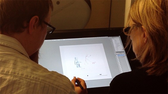
The old adage ‘A picture is worth a thousand words’ often rings true when it comes to crafting a presentation. Whether it’s a graph that helps your audience better understand a complicated concept or an evocative photograph that allows them to glimpse into another world, images are powerful storytelling tools (see Hans Rosling’s TED Talk The best stats you’ve ever seen for a first-rate example). As TED-Ed Club Members search for the visuals that best tell their stories, we called in The New Yorker writer and cartoonist Liza Donnelly and TED-Ed animator Jeremiah Dickey to share some helpful hints on the matter.
TED-Ed Club Members from Georgia, Missouri and Botswana worked with Liza and Jeremiah, delving into everything from how to develop their own visuals to the more nitty-gritty process of pacing visuals throughout a presentation. Liza and Jeremiah helped one TED-Ed Club Member brainstorm ways to make a fun, intuitive infographic about overfishing (spoiler: using a segmented graph in the form of a fish) and helped another think about a visual showing the nomenclature of dinosaurs. We definitely can’t wait to see those in the forthcoming presentations!
Some main pointers Liza and Jeremiah shared:
- A picture really is worth a thousand words. Use silence and visuals to your advantage. Allow your audience to contemplate the information conveyed through the visual.
- Be patient. Sometimes you have to draw and create a hundred different visuals before you find the one that encapsulates your idea.
- Always practice. Both with and and without your visuals. You’ll sometimes learn that you may not need that extra photo after all … and that’s okay. After all, visuals are there to enhance the message of the presentation, not distract.
Interested in hearing more about using visuals? You can watch the entire workshop with Liza and Jeremiah here:


Hey! How do you join this awesome club?