Designing Einstein: 2 animators use minimalist style to illustrate history

When Oxbow Creative, the animation team behind our recent lesson on Einstein’s miracle year, turned in their final animation to TED-Ed, our production team was shocked to see that the file was under 1 GB. Normally, an animation of this length will range anywhere in size from 2 – 5 GB, but rarely will we see one under 2 GB, much less 1. Any fears that this small package wouldn’t pack a huge punch, however, were squashed when we saw the final product: the lesson is clever, swift and striking, using a beautiful, minimalist style to communicate the history of Einstein’s highly successful 1905. We caught up with Oxbow Creative’s Evan Deutsch and Jon Portman to talk Einstein, minimalism and capturing the relative speed of planetary orbits.
The animation is beautiful. Tell me more about the minimalist style you employed for this lesson. Is this your go-to style?
JP: First off, Einstein was, by all accounts, a jovial character and a bit of a troublemaker, so we wanted to keep the illustrative style light and fun. We also chose a minimalist visual program with a very controlled, tricolor palette, keeping most of the action small and center-screen. The four theories discussed in the story have had a massive influence on our understanding of the universe, and yet they came from inside the head of this odd little German fellow who reviewed patent applications for a living. This disproportion was what inspired us to portray Einstein as a brave little character in a world too big for him. Quite fittingly, once he gets his deserved recognition in the final sequence, the scale snaps back in the opposite direction and our solar system is revealed to be Einstein-centric after all.
Although I wouldn’t go so far as to call our go-to style minimalist, we certainly hate clutter. In all of our work, especially projects with complex concepts, we feel that filling the screen with distracting, in-your-face graphics and transitions does a huge disservice to the viewer. We prefer to concentrate their attention on focused, thoughtful action that they can absorb and retain. “Less, but better.”

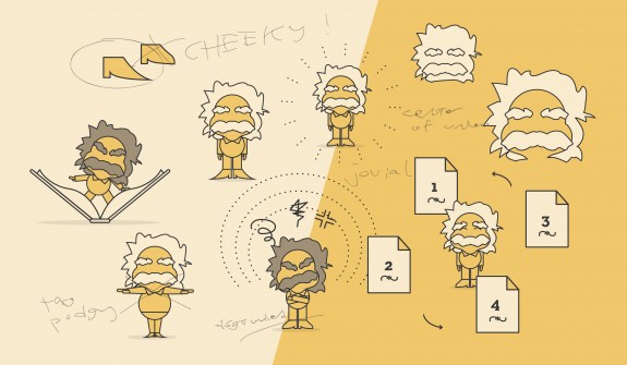
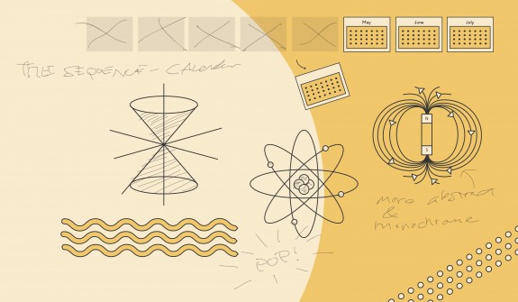
Visual Program Sketches: Our early attempts at establishing a graphic system for portraying the scientific concepts.
How long did the animation take you to finish?
ED: Start to finish, this project took us about 7-8 weeks. Internally, we went through several rounds of illustration and storyboarding until we felt we really captured the dichotomy of Einstein’s quirky, whimsical character and his world-changing discoveries. We also went through several rounds of feedback with [TED-Ed Educator] Larry [Lagerstrom] to ensure that all the details were accurate from a scientific perspective. Having the academic support of Larry and the creative feedback from TED-Ed made for a really stimulating and efficient process.
The music for the piece is also great. How did you pick it?
JP: We knew we wanted something in the classical genre, to echo the elegance of Einstein’s theorems, and we happened upon this beautiful little arrangement by Debbie Miller and Gavin Keese. We were super psyched when we first heard it; its energy and tone just felt right for the story, and it has this great alternative, almost gypsy-like feel to it. We consider the musical accompaniment to be just as important as the animation itself, so we try to find the right track early on and let it inform our visual process.
Did you get to choose the subject for the lesson, or was it chosen for you?
JP: TED-Ed is really great about giving the animators priority over the subjects they feel passionately about. We submitted a list of a few subjects we were interested in, highlighting Physical Science as our first choice. I took quite a bit of Physics classes while at school (one credit away from a Minor, much to my chagrin) and have always been fascinated by how the universe behaves. When I mentioned this to the TED-Ed folks, they handed us the Einstein script, and we immediately jumped at the chance to bring his story to the screen.

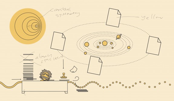
Composition and Action: Exploring how the different elements interact with one another, paying particular attention to viewer focus, color, proportion and lineweight.
What was the most interesting thing you learned about Einstein over the course of the lesson?
JP: Without a doubt, it would be the fact that Einstein published all four papers within the span of seven months, during which he was working six days a week. I think it’s safe to assume he did quite a bit of day dreaming at his desk job. And scarily enough, he was just about our age when he did so.
Any pitfalls along the way?
ED: Honestly, not really. Because of the seemingly limitless possibilities to approaching Einstein’s character, getting started actually proved the biggest challenge. It took us quite a while to land on a look and feel that felt 100% right. We love this part of the process, though!
What was your favorite part of the process?
JP: Our favorite part was also the most challenging: maintaining scientific accuracy in portraying the concepts. Larry was hugely helpful on this front. For example, in the solar system scene at 0:47, while it’s certainly not to scale, the planets are actually orbiting at the correct speeds relative to one another (please tell me someone noticed this; it took an inordinate amount of time to figure out).


i just will write down this comment to till JP that i noticed the relative speeds of the orbiting planets, it was a really nice touch those little details that make a great learning video/object
thanks