How an animator brought stage fright to life

As part of the newly minted animation studio KAPWA Studioworks, animator Robertino Zambrano directed educator Mikael Cho’s TED-Ed Lesson, The science of stage fright (and how to overcome it). We asked Robertino about his journey to the field of animation and the experience of animating this visually striking lesson.
What inspired you to become an animator? How did you start in animation?
The first three things I saw that made me want to do animation were Tarzan, Lion King, and Toy Story, which I saw during my high school days. I ended up taking on a design degree at UTS in Sydney, and my animation obsession was replaced by a design obsession. But halfway during my design degree, I got my first exposure to the world of motion graphics: I saw an amazing design and animation studio called MK12 speak at a design conference. These guys exposed to me to a whole new field of creativity, which would let me combine my love for design with my love for animation. After that, I focused all my subjects at uni on anything motion and film related.
What inspired the visual style of this lesson?
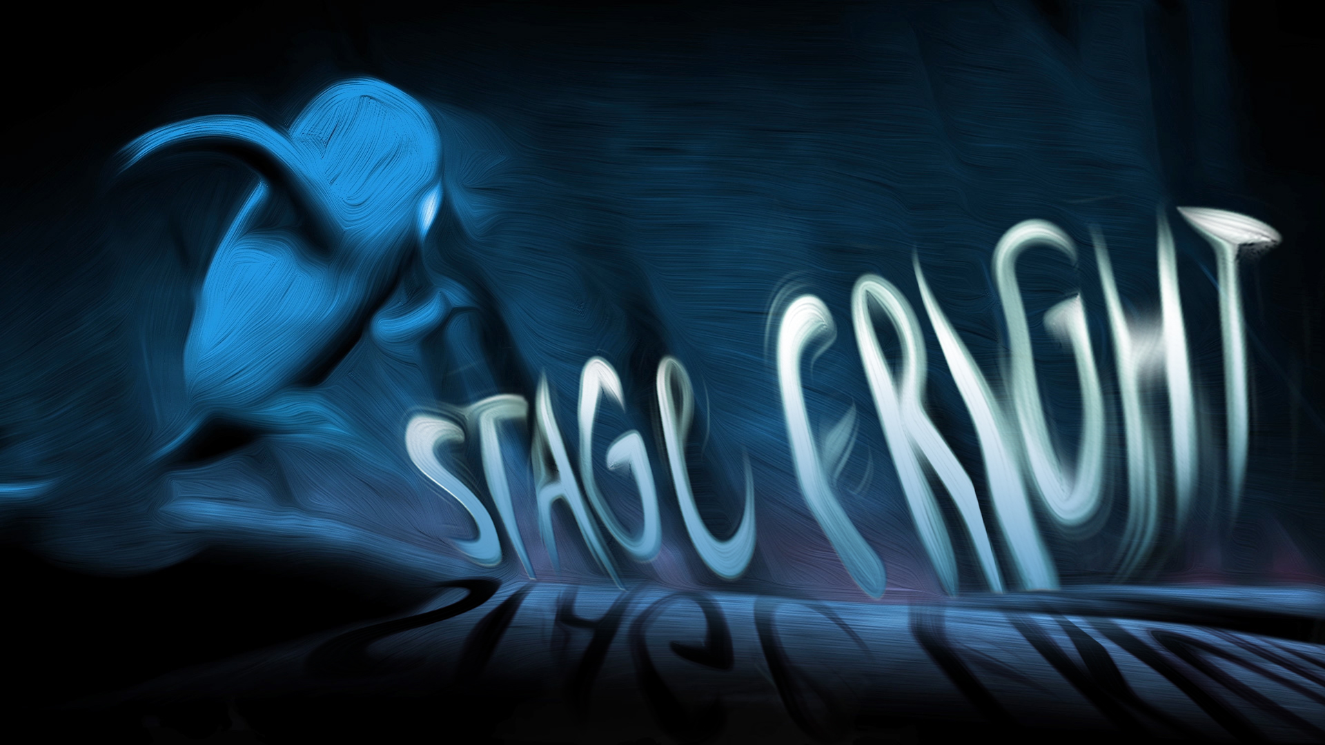
Well, after reading the first lines Mikael Cho’s script, quite a few images popped in my head. This [lesson style] needed to be dark, it needed to be frantic, it needed to be really, really visceral. If you close your eyes and think about the most immediate image of stage fright, you think about the lone speaker under the spotlight, separated from the masses, looking at you, judging you. You think about the harsh lighting, long shadows, and hidden faces of the audience. So, the first image I painted up was the opening shot, right before the title, which shows the speech-giver looking at a faceless audience, eyes wide in fear, alone under the spotlight.
I also chose the handmade painterly feel to maximize the rawness of the piece. Fear isn’t nice and polished; it’s gritty, and it’s dirty, and it’s like a bad, bad dream.
What was your favorite part of working on this lesson?
Hard question! So many fun bits to choose from. I’d have to say animating the characters, especially the forest chase scene was pretty fun. Creating the process to get that right look for the painterly look and feel was also really, really satisfying. I’d have to say that working with Adam Alexander and John Romeo at Bamm Bamm Wolfgang to create the score for the piece was such an enjoyable part of the project. Everyone seems to dig the music!
What were some challenges you faced while working on this lesson?
The first was trying to maintain the balance between keeping the piece as dramatic, entertaining, and powerful as possible, while staying true to the scientific lesson in Mikael’s script.
Secondly, the script and the animation is mostly quite dark, but we had to make sure the style we had designed still allowed for the positive turning point towards the end of the animation, where we work out how to beat stage fright. The music played a massive role in making this emotional transition work.
Another main challenge was actually trying to nail down the right technique to make everything look like it had been painted. There were no existing plug-ins that actually got the effect we wanted, so I had to create a new production pipeline which reprocessed our animation over three separate passes to get that right look and feel. So, for a little while at the beginning, we were making it up as we went along, but we worked it out eventually!
Did you learn something new from working on the lesson?
Well, now I know how to deal with a flight-or-fight response (for instance, DON’T run through a forest or jump off a large rock pinnacle!). And I definitely learned a ton of new animation techniques.


